That buttons gonna be a UX failure!
When it comes to concepts for buttons in a game there are some essential requirements that have to be fullfilled. They need to be easy recognizable, follow a consistent style and do what the player assumes.
Net.Attack()'s style for UI was created to be mostly filigree, subtle and elegant. As it is supposed to represent a coding game, it concentrates on using text where possible rather than icons. So I came up with the idea of using only text for most buttons: no frames, huge clickable areas or fancy icons.
That’s when the struggle started:
There were questions like: Do we really want this to have no frame? Don’t we want to colour the background? Are we sure this has to be that small, nobody will notice?! But we decided to give it a try and believed it could work.
What we are talking about:
This is an example of the final button design:
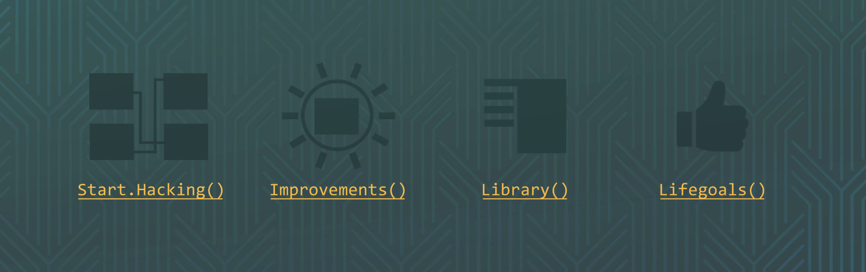
The goal was to establish a uniform sign language for everything that functions as a button. Therefore we used underline, brackets at every end and points to seperate different words if namings got too long to be read clearly in pascal case. We wanted it to resemble a sort of text hyperlink style.
The game’s user interface has kind of a green, blue and purple look, which are perceived as “cold colours”. So for the buttons we wanted to choose a dedicated “warm” colour to build a contrast and really pop out.
Apart from the actual design we used the context the buttons are put in to communicate their function. Players are used to navigating through main menus and in our case desktop interfaces. They are expecting buttons like “play” and having this in mind we taught them what our ones look like.
And now? Was it a UX failure?
I’m glad to answer: “No, it wasn’t!” We had a couple of player testings that prooved that the design got the job done. Far better than some of us expected. It seemed to be a risky decision but ended up perfectly.
Comments
Log in with itch.io to leave a comment.
Really liked the idea of making the buttons plain text and writing the names like a function call in code. I agree that it was pretty obvious these were clickable—glad you tried it!